
TL;DR;
I needed 96 consistent aircraft silhouettes for my flight tracker app, and manual production would have been far too slow and expensive. By combining AI image generation with deterministic post-processing, I built a workflow that is fast, scalable, and cheap enough for real product use.
The problem
Business requirements were clear:
- uniform scale across all aircraft
- professional, catalog-like quality
- consistent lighting, shadows, glare, colors, and reflections
- transparent backgrounds (nice-to-have)
Doing this manually would take ages or cost thousands of dollars.
The solution
I used OpenAI’s gpt-image-2 model via API for generation, combined with deterministic scripts for background removal.
The workflow:
- prompt engineering with Perplexity
- use OpenAI API to batch create images
- I created a matrix for testing image quality
- for me these configs worked best: quality medium, resolution: 2K
- I generated in batch 96 aircraft via a short JS script, connecting to OpenAI API
- I post-processed all those images using local tools (JS script)
Results:
- 90/96 images were production-ready immediately
- 6 outliers regenerated successfully (issues: weird brush artifacts, missing glare)
- Total cost: $8.80 ($4 for experimentation + $4.80 for production)
- Time: ~30 minutes (limited by OpenAI rate limits on a new account)
Examples:
| Airbus A320-200 in Lufthansa livery | Airbus A320neo in Air Canada default livery | Airbus A350-900 in Finnair unique Marimekko Kivet livery |
|---|---|---|
 |  |  |
Need broader context? Let me invite you to full content below!
Why do I need aircraft silhouettes?
It is a bit longer story, so, let me introduce myself (just a little). I am an aviation enthusiast. Flight simulation is a significant part of my life, outside my daily chores as a programmer and a speaker. I spend considerable time on different flight simulators like Microsoft Flight Simulator, simulating real-life airliner flights, following realistic procedures, checklists, and weather. I fly scheduled routes, follow real airline patterns, and often attempt to replicate actual passenger flights I have taken or plan to take.
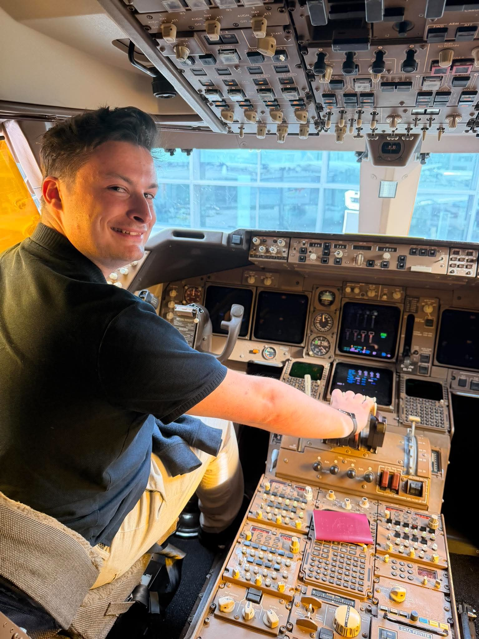
Me in the cockpit of one of the last Boeing 747-400 flying for Lufthansa, after Toronto (YYZ) to Frankfurt (FRA) flight.
If you spend Friday night at the bar, or at the party, you will find me usually somewhere over the virtual Atlantic Ocean, probably on the VATSIM network. Over a virtual pond, in the virtual cockpit, following other virtual planes, with an urge to follow close-to-life rules. Yes, I’m already diagnosed, thanks for asking. This deep engagement with flight simulation has made me a recognizable member of the flight simulation community. I contribute to forums and engage with other sim pilots regularly, I also developed quite a lot smaller and bigger software tools for simulator-led flights.
Me, performing virtual VCP24CP flight from New York (EWR) to Amsterdam (AMS), during the CrossThePond 2025 event. Over 2700 virtual pilots connected using ADSB-over-HTTP, my little transponder project.
Beyond personal hobbies, I built a Flight Tracker application that enables users to follow their flights in real time. The app connects to your simulator, transmits your position, heading, altitude, and multiple other, different details, shows aircraft position, manages flight plans, paths, and airline information. I even implemented my own implementation of ADSB-over-HTTP transponder to standardize how simulator pilots exchange position information — we closely follow ADSB ARINC 24-bit transmission, but using TCP and HTTP protocol as a medium. Currently, my project is the core part of VATSIM Radar app. If you take a look, you may find that hundreds of people around the world are the part of this solution.
However, one challenge I faced is the presentation of the data in my app: how to represent each aircraft type in a way that is clean, **consistent* and visually appealing across the entire interface? As graphic eye candy, I thought I may use aircraft silhouettes. A silhouette is a simplified, clean representation of an aircraft that captures its essential shape without unnecessary detail. Having a single, generic silhouette for each aircraft type is already useful. For example, showing “this is an Airbus A320” when tracking a flight would make the user experience more personalized, more connected, more **visually appealing**.
But if we can adjust the silhouette to match the specific plane someone is flying (e.g., with the correct livery, specific variant, or unique features), it would be even more impactful. This personalization adds a layer of authenticity and emotional connection to the user experience. When a user sees their flight tracked with a silhouette that looks like the actual aircraft they are on, it creates a more memorable and engaging experience.
The combination of my personal aviation passion, flight simulation expertise, software engineering knowledge, and finally the technical art of bodge-ing different solutions together led me to this study. I need a way to generate at least a dozen of aircraft silhouettes that are consistent, professional, and scalable: something that traditional manual methods could not provide efficiently.
Let us talk business requirements
All this story can be simplified to business requirements. The flight tracker application needs aircraft images that meet specific standards:
- all silhouettes must be uniformly sized, regardless of the actual aircraft dimensions. This ensures visual consistency across the interface,
- the images should look professional and polished, catalog or retail product imagery: they need to be clean, consistent, and free of artifacts,
- all silhouettes must share the same lighting, shadows, glow, colors, and reflections,
- silhouettes need transparent backgrounds (PNG format) to integrate seamlessly into the UI without visible borders or colored backgrounds.
- people don’t like images from AI that look like slop, I need to control the output in a way it does not feel that is AI-generated
These requirements are difficult to achieve manually at scale. Each aircraft would need to be individually photographed or rendered, then manually edited to match the style. This is time-consuming, expensive, and hard to maintain. AI-generated silhouettes, combined with deterministic post-processing, offer a practical solution that meets all these requirements while remaining cost-effective and scalable.
Getting the right tool for the job
Sampling aircraft silhouettes for this project could be approached in several ways, ranging from fully manual workflows to modern AI-based generation.
Old-school
As a lazy engineer, I do not know how many airframes I want to add. I do not know, because I do not know the price of the solution yet: and as a price, I mean primarily time here, not money. To prepare 30+ graphics one-by-one manually, I would need to open a Photoshop project for each aircraft, finding a good base image, aligning the display style exactly (unified glow, reflections, profile, shadows). Photoshop professionals would do it probably pretty fast, but I am certainly not a Photoshop professional.
Even if I find the time and internal motivation to do this, it is an absolutely repetitive, boring, and tremendous job.
Searching for a better solution
Searching for something faster unfolded to some bad and good experiences. First, I asked Perplexity directly to generate me an Airbus A380 silhouette. Let us start simple, I thought.
Well, okay, I am based in Europe; probably that is why. That did not break my back, I am better than that. I used Perplexity to generate me a prompt for any other image generator. This time, it worked very well, actually.
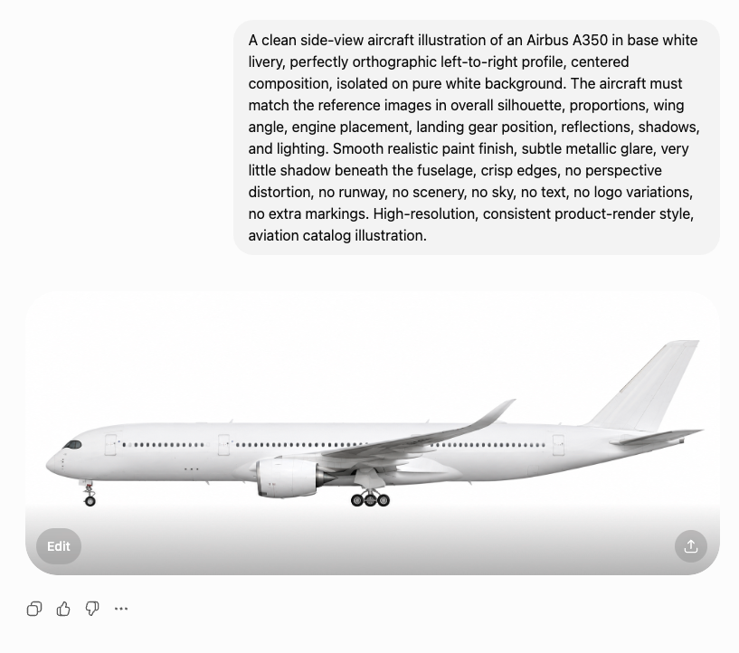
I changed the requested airframe to an even more graceful Airbus A350, and I pasted the prompt to my free ChatGPT account. The output was immediately impressive. The aircraft silhouettes were structurally correct, lighting and shadows were consistent, and the overall visual style was clean and professional. This was the first “wow” moment I had during this study.
I asked to generate more airframes for me, and unhappily, the results were not as good as the first glance. After the third request, a banner “please, buy our $90/mo subscription to continue” jumped in. Pretty expensive as generating materials for a side project I am not sure about, I thought.
Since the overall quality was solid, I did some more research, how to pay for the resource, and decided to use OpenAI’s API version rather than the chat interface. The API gives me programmatically accessible control over resolution(std, 2K, 4K), quality settings, background and file format. This is exactly what I need for batch generation and an illusion of systematic A/B testing. I liked the first version, so I decided to sell my soul, I paid $15 up front to OpenAI Platform, and I started bodging new things.
First outcomes
OpenAI exposes several parameters for image generation, including resolution, quality, background, and output format. For this work, I used the gpt-image-2 model, as it is currently the most capable option available and handles structured prompts reliably.
The main uncertainty was around resolution and quality settings. Rather than assuming defaults, I tested different combinations to understand their impact on generation time, cost and output characteristics. The goal was to find a practical sweet spot producing results just good enough for further use without overusing resources.
I drafted the first version of the prompt with Perplexity. Then I iteratively refined it based on observed outputs. This approach allowed quickly establishing a solid baseline. Now prompt looks as follows:
A clean side-view aircraft illustration of a
shown as a strict orthographic left-to-right profile, centered composition, isolated on a pure white background. The aircraft must match the reference images in overall silhouette, proportions, wing geometry, engine placement, landing gear position, fuselage curvature, tailplane shape, reflections, shadows, and lighting. Use a smooth realistic paint finish with subtle metallic glare, very little shadow beneath the fuselage, crisp edges, no perspective distortion, no runway, no scenery, no sky, no text, no logo variations, no extra markings. High-resolution, consistent aviation catalog illustration, reference-faithful product render.
Testing different quality options
To systematically assess the impact of different generation parameters, I conducted a series of manual A/B/C tests on the generated images. This approach enables direct comparison between controlled variations, allowing for more objective evaluation of how quality setting influences the resulting image. As far as I researched, there is no other reliable and repeatable way to assess quality, as AI models analyzing AI-generated images are way more prone to hallucinate about the results. AI models are not seeing models as humans, and if keeping these graphics not looking like cheap AI is our goal, it is the only way to go.
That is the tradeoff of undeterministic solutions: when we look for aunthentic look, something that is simple to distinguish for a human eye is almost impossible to catch by the algorithms (as long as they are not precisely trained).
OpenAI describes parameters in their API in very sloppy way (it was surely generated by AI):
The choice of quality has a direct impact on visual fidelity of the generated images. Lower quality is typically sufficient for rapid prototyping, previews, or applications where fine-grained detail is not critical. In contrast, high quality enable more precise rendering of structural elements, edges, and textures, which is particularly important when generating detailed objects.
Let us just compare the results ourselves. In the table below, examples of the Airbus A380-800 generated with varying quality settings are presented for comparison:
quality: low | quality: medium | quality: high |
|---|---|---|
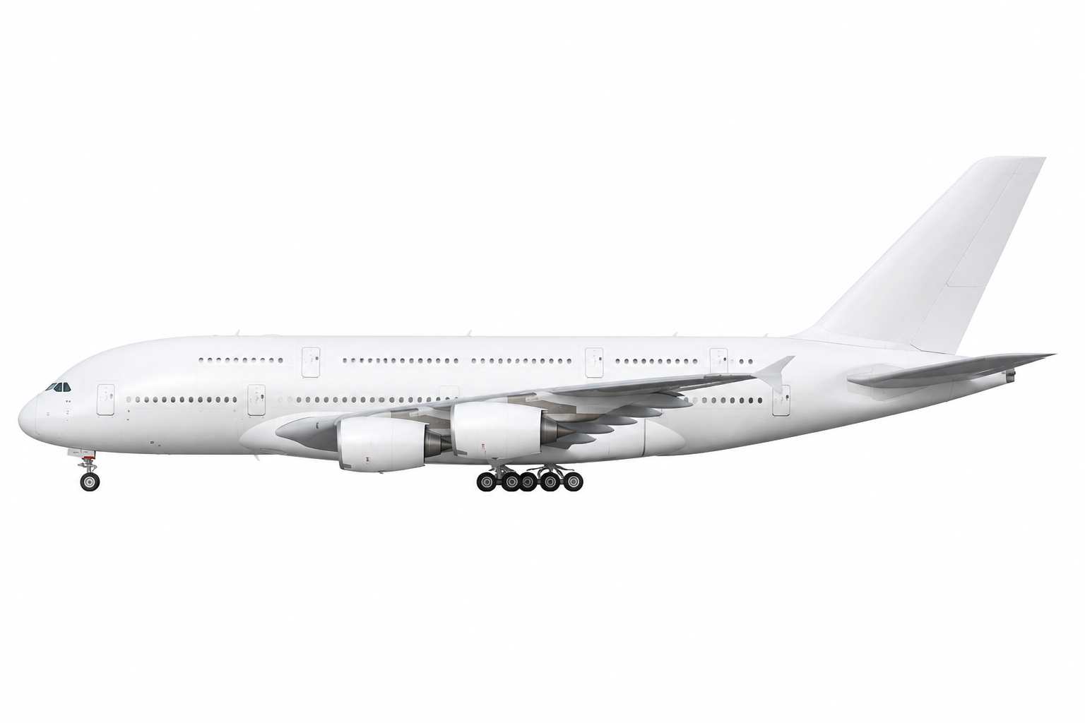 | 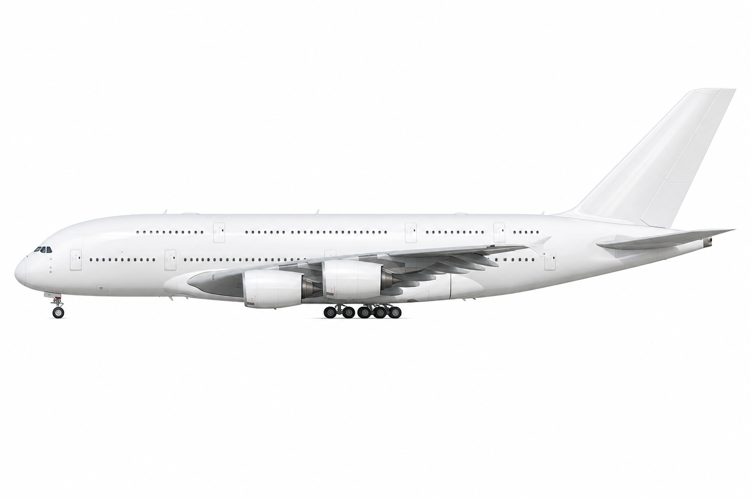 |  |
By looking at examples of this and a few other airframes, I decided to continue with the medium quality, as an optimal trade-off between computational cost and output fidelity. It provides consistent enough and detailed results for my side project.
Testing different resolution options
OpenAI Platform API provides several predefined image resolution options that can be specified at request time. Although
the API supports multiple configurations, the available choices remain relatively constrained. In practice, users can
select between a standard resolution (std), corresponding to 1536×1024 pixels and higher-resolution variants such as
2K and 4K. These predefined settings are designed to balance computational cost, generation time, attention to
details.
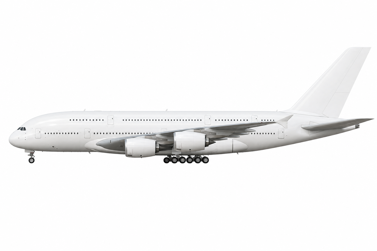
In a table below, examples of the low quality Airbus A380-800 generated at different resolutions are compared:
resolution: std (1536x1024px) | resolution: 2K (2560x1440px) |
|---|---|
|  |
In a table below, examples of the low quality Airbus A380-800 generated at different resolutions are compared:
resolution: std (1536x1024px) | resolution: 2K (2560x1440px) |
|---|---|
|  |
Nondeterminism is evident
AI-based image generation is inherently nondeterministic, which becomes obvious very quickly in practice. Even with the exact identical prompt, the outputs differ from run to run, making reproducibility difficult. Writing the prompt itself is also more tedious than expected: details that feel implicit often need to be spelled out, otherwise the model starts drifting in unexpected directions. When I ask about generating me an illustration of an aircraft, I do not want to have a name printed on the graphics; I do not want to have some technical details, I want a plain image. If I specify I want a plain image, often it is not enough: I need to point out precisely that I do not want any additional content, by specifically pointing out which additional elements I do not want. Tedious, but I quickly understood “do” and “don’t” regarding prompting for image generators.
If a result is off, the simplest workaround is to generate another image with the same prompt. This helps in practice, but it is not a reliable way to converge on a specific outcome. Because of that, this approach is unsuitable for use cases that require strict determinism. That said, for most practical scenarios, a “good enough” result is enough and aligns well with a Pareto-style trade-off, but it will never be suitable for work requiring precision.
The issues become more noticeable when looking at specific parts of the aircraft. For example, the landing gear is often inconsistent between generations — not just in configuration, but in perspective. In some cases, the number of wheels, or their arrangement changes; in others, the geometry does not fully match the rest of the aircraft orientation, as if different reference views were mixed. These are not just stylistic differences but actual structural inconsistencies. Minor inconsistencies will not be seen by most of the people, but when we design an app for aviation geeks, they will quickly notice the difference.
Because of this variability, fully automating quality control is sometimes challenging and expensive. In most scenarios, it is impossible at all. Some level of manual inspection is still required, and will always be required to catch errors that are obvious to a human but hard to formalize in a validation pipeline.
Batch generation
Starting lean
I was impressed enough with the initial results to continue the study by generating silhouettes for all the most popular aircraft in the flight simulation community. Instead of building a complex system, I kept it lean: I asked Perplexity to generate a batch script for me, and after a few minimal optimizations, it was up and running.
The script was set up to read aircraft data from a CSV file, like this:
icao_code,descriptive_name
A20N,"Airbus A320-200N"
A310,"Airbus A310-304"
A30F,"Airbus A300F4-600R"
B735,"Boeing 737-500"
This approach allowed me to generate hundreds of images in one go, with each row representing a different aircraft type. The script handled prompt construction, API calls, and file saving automatically, requiring almost no manual intervention after the initial setup.
The full script can be found on my GitHub repository.
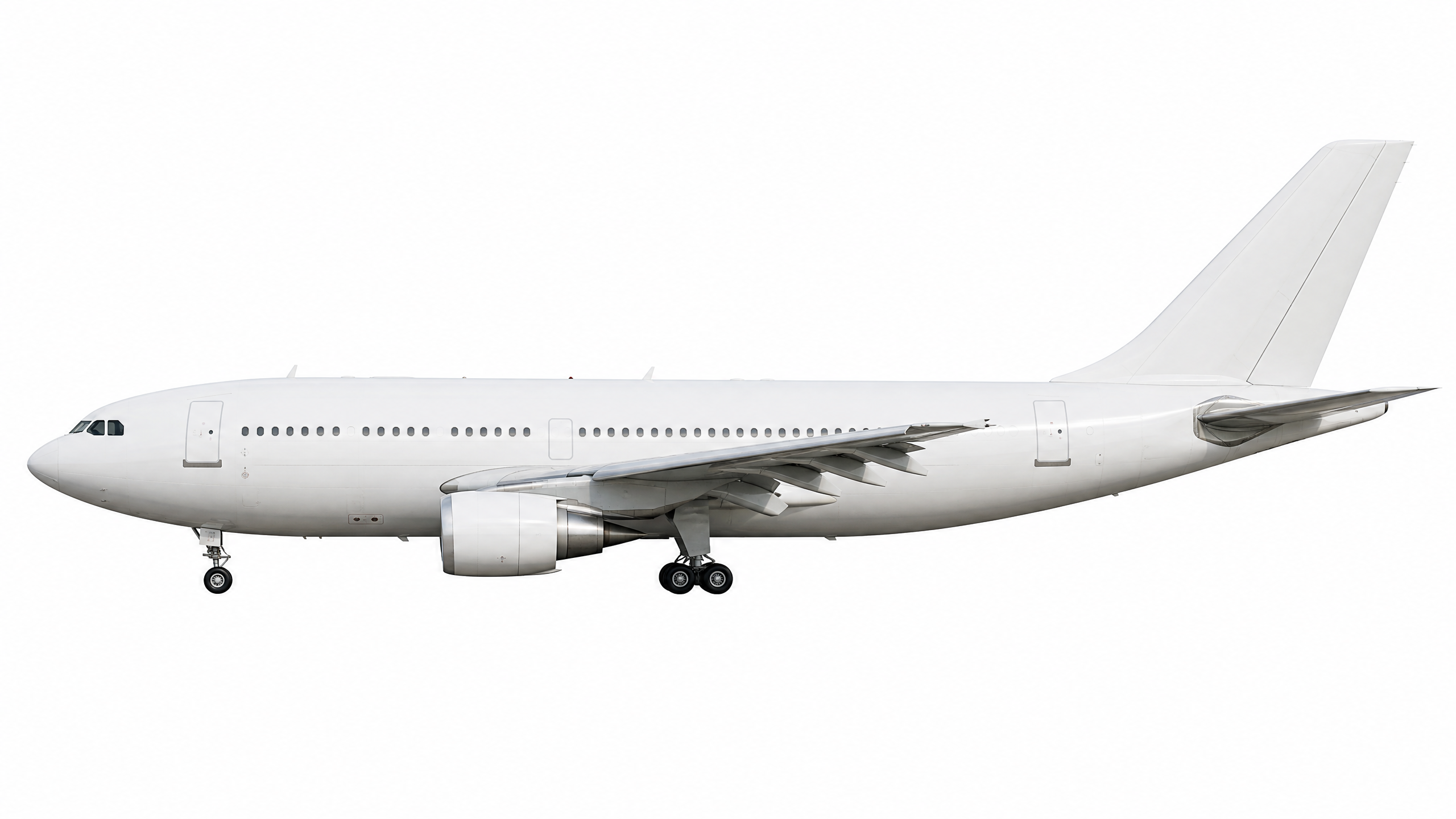
Initially, I ran the batch script for just the four aircraft listed above. The results were outstanding: this was the second time during this research that I genuinely thought “wow”, second time in this study.
The generated images were immediately convincing. All four silhouettes shared the same visual style—unified glow, shadows, glare, colors and reflections. There was no need to manually adjust each image to match the others. Image quality was high, with clean edges and well-defined structural details. The aircraft geometry was very accurate, and the overall rendering looked professional. Even when viewed at the detail level, the images remained clear and free of artifacts. There were no strange distortions, missing parts or visual glitches that appear in AI-generated outputs.
This was a strong validation that the approach was viable for scaling to the full set of aircraft in my app.
Going full-scale
After validating the approach with four aircraft, I ran the same script on a full dataset of 96 aircraft. I would not have attempted this if the process had not been so simple: once the script was ready, scaling was just a matter of pointing it at a larger CSV file.
The batch run took over 30 minutes to complete, primarily due to OpenAI API rate limits on a new account. Despite the wait, the results were once again amazing. This was the third time I said “wow” during this research.
When I looked in detail on every image, they were consistent and free of major glitches. However, I noticed a few issues with certain airframes.
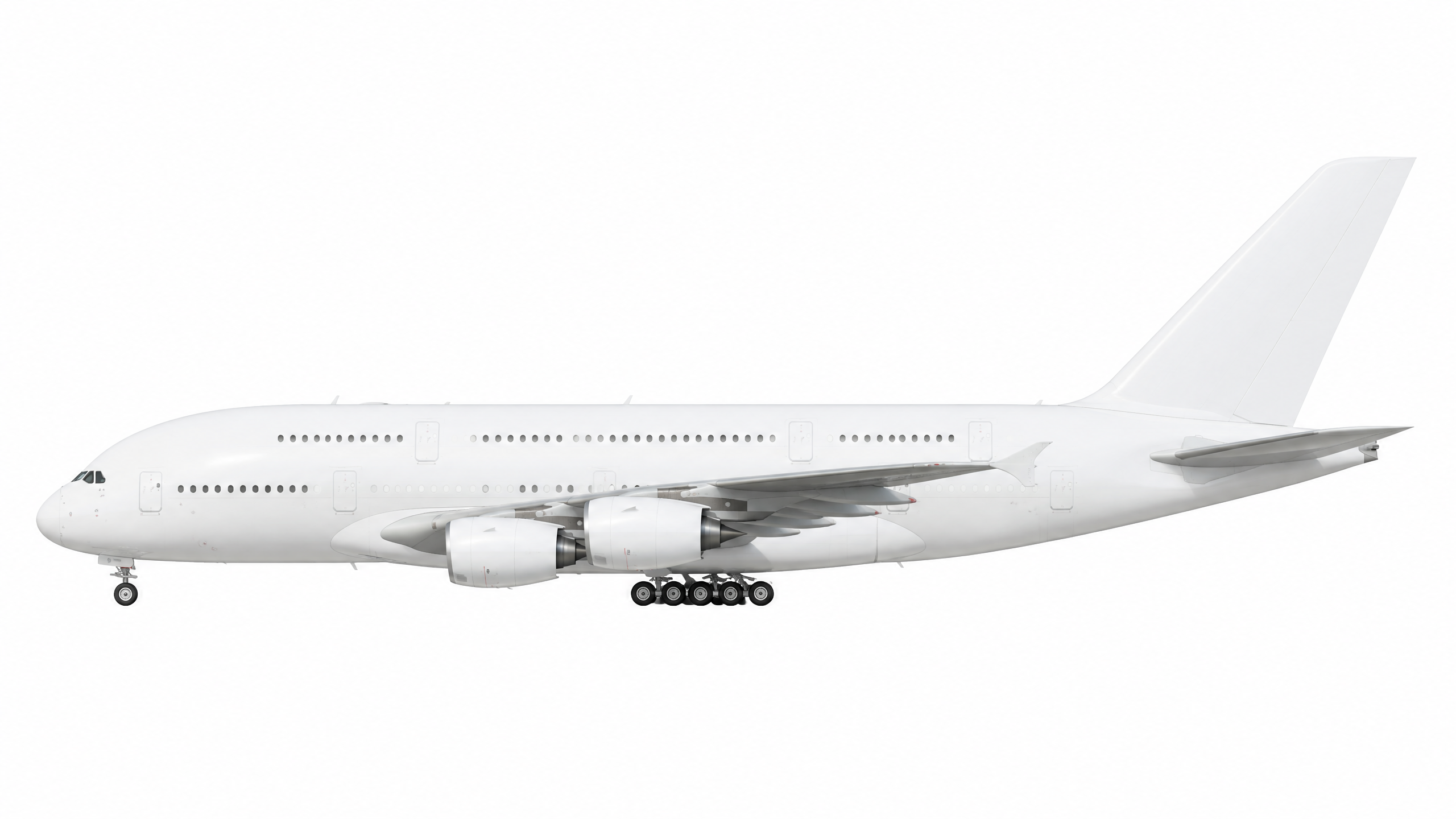
| Airbus A300-F | Airbus A310 | Boeing 737-500 |
|---|---|---|
 |  | 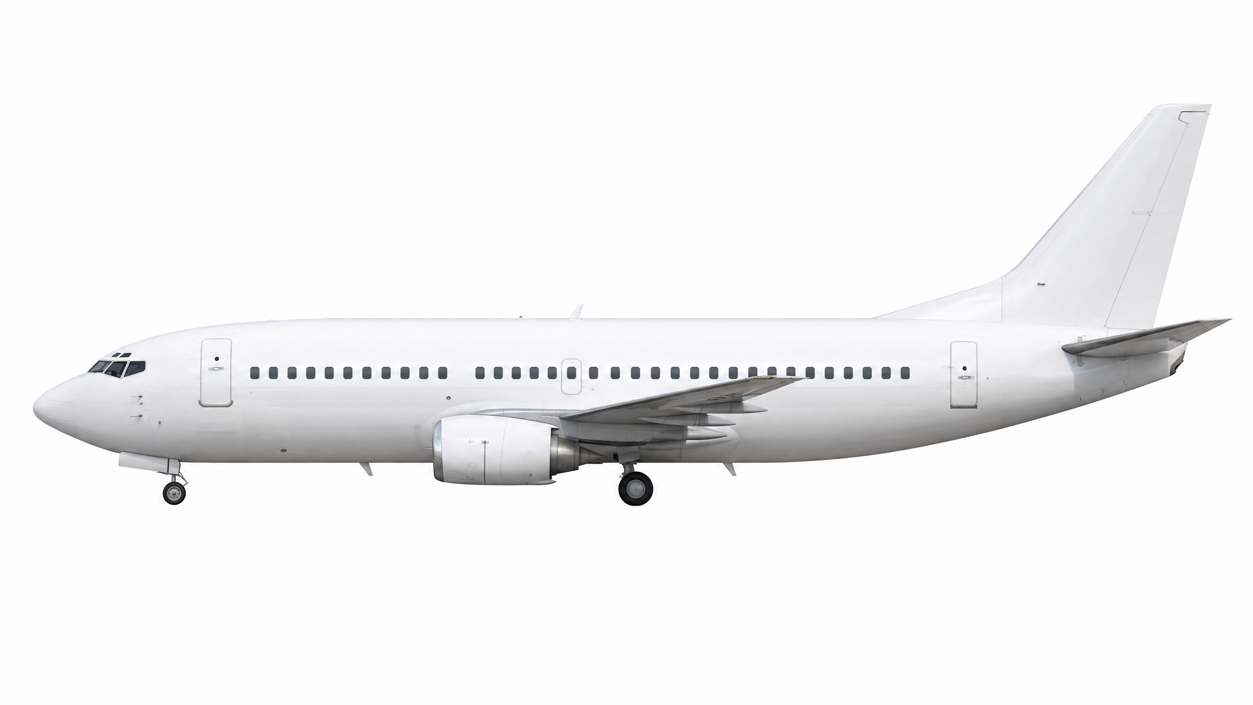 |
It is hard to describe these issues in human language: the problem is that they just look outstanding in a negative way and do not fit with the rest of the aircraft. For example, the Boeing 737-500 has weird brush-like artifacts, and the Airbus A310 is missing glare on the left side of the fuselage (even though it is glossy near the tail). These inconsistencies are subtle but clearly visible when you look at the full set.
I regenerated those specific images using the same prompt, and the second batch fixed the issues. This confirms that the workflow is not just viable for large-scale generation, but also resilient enough to handle occasional outliers through simple re-generation.
Post-processing images
OpenAI provided me a strong foundation, but post-processing is still required to make the images ready for production
use. The raw outputs from the model need background removal and adjustment to web app requirements (transparent
background). Removing background is also not just a simple replacement: as it turns out, the background on
AI-generated graphics is not ideally white (#FFFFFF) - it has patches and scratches, which is weird, because prompt
directly asked about a perfect white background. Things that are certain for scripts and humans are uncertain for LLMs,
and that is just another example of possible issues coming out.
Transparency dilemma
LLMs and other diffusion-based image models like gpt-image-2 are fundamentally not designed to create transparent
backgrounds. These models operate by generating pixel values in RGB space, where each pixel has fixed color values.
Creating transparency requires an alpha channel (RGBA), which represents per-pixel opacity—a concept that is not part of
the model’s training objective or output format.
Even when models claim to support “transparent” outputs, they typically do not generate true alpha transparency. Instead, they either:
- generate a solid background and mask it afterward using deterministic algorithms like color thresholding, edge detection, or Difference Matting,
- output a white/colored background that the user must remove using external tools or scripts.
The official OpenAI documentation explicitly states that gpt-image-2 does not support transparent backgrounds, and
requests with background: “transparent” will fail. If transparency is needed, users must route those tasks to a
different model (like gpt-image-1.5) or apply post-processing.
Hybrid solution for the win
I asked Perplexity to generate a JavaScript script for a batch background removal. The first version of the script worked well for roughly 70% of the aircraft. For the remaining 30%, however, there were visible artifacts (click to zoom and see the details):
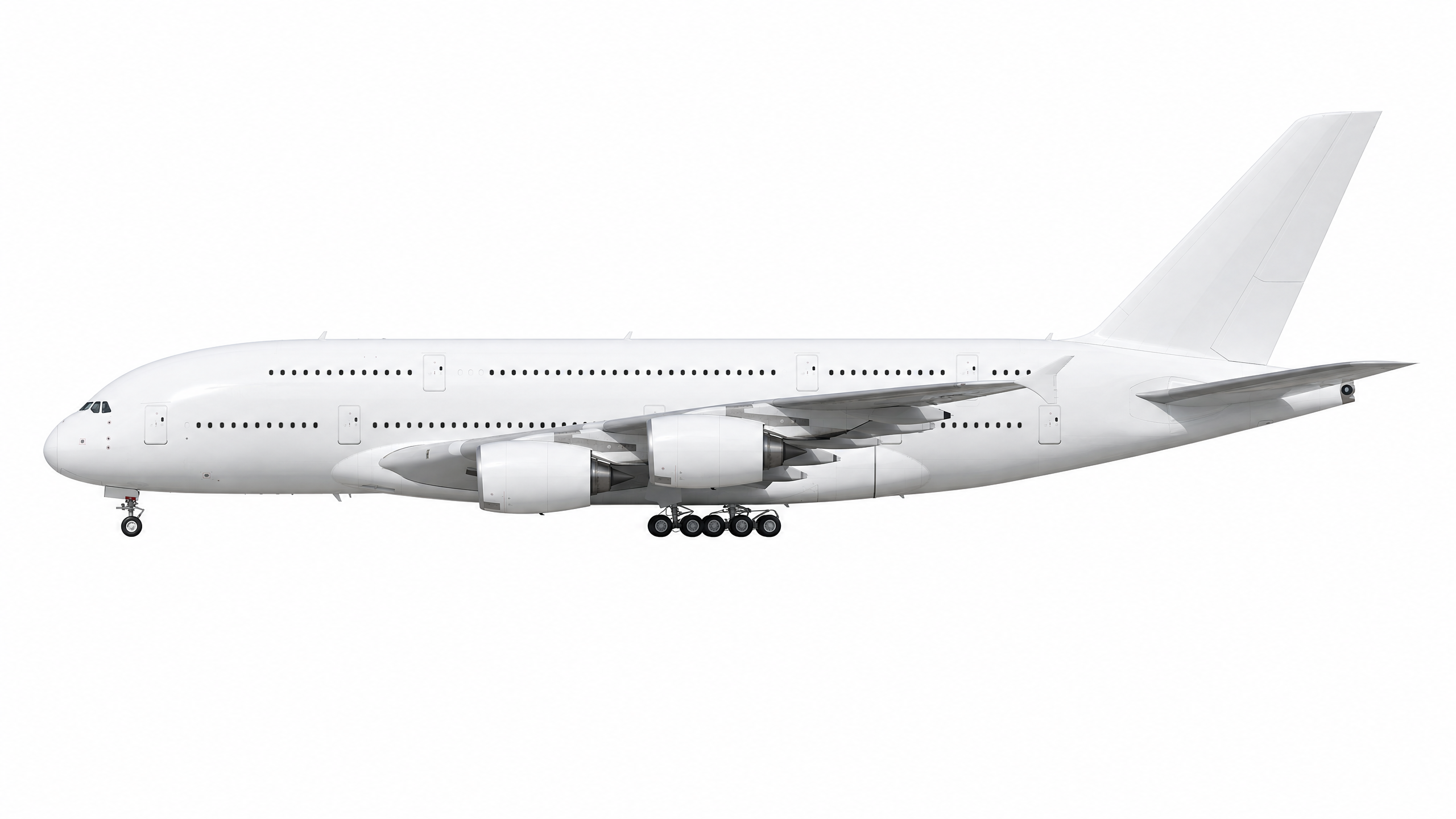
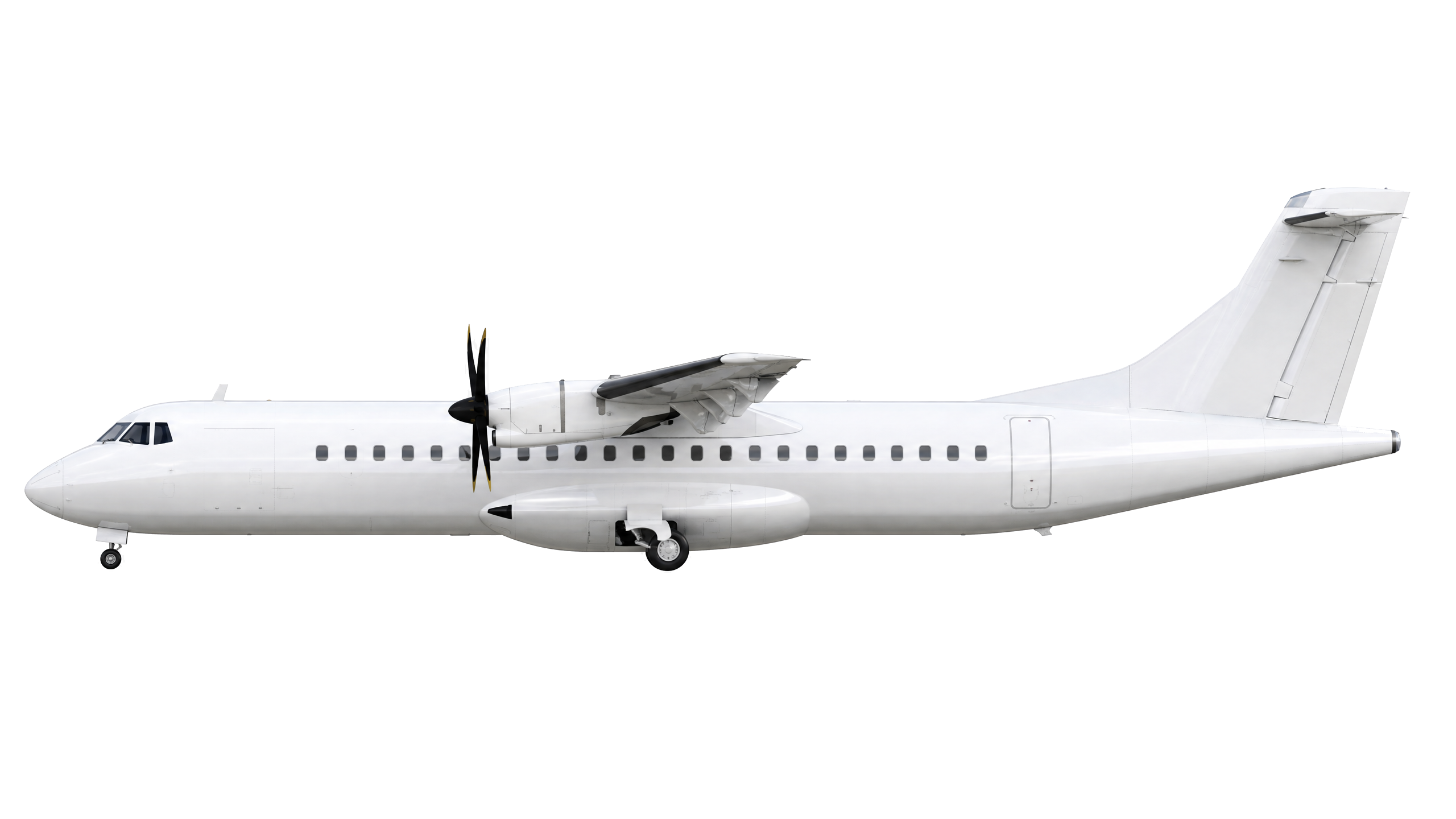
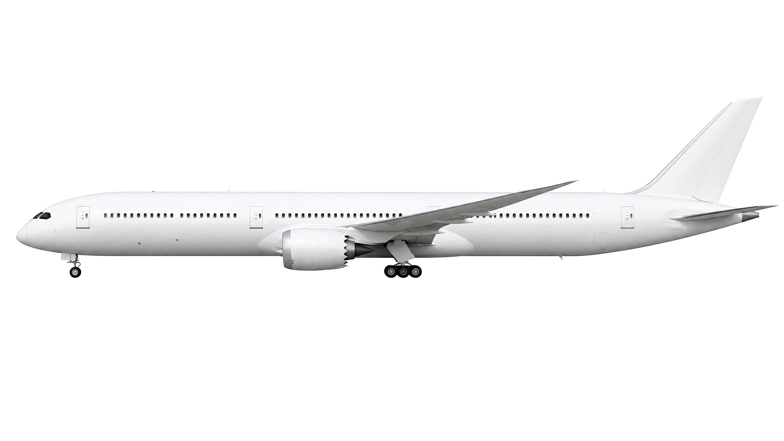
| ATR 72 | Boeing 787-10 Dreamliner | Boeing 737-800 |
|---|---|---|
 | 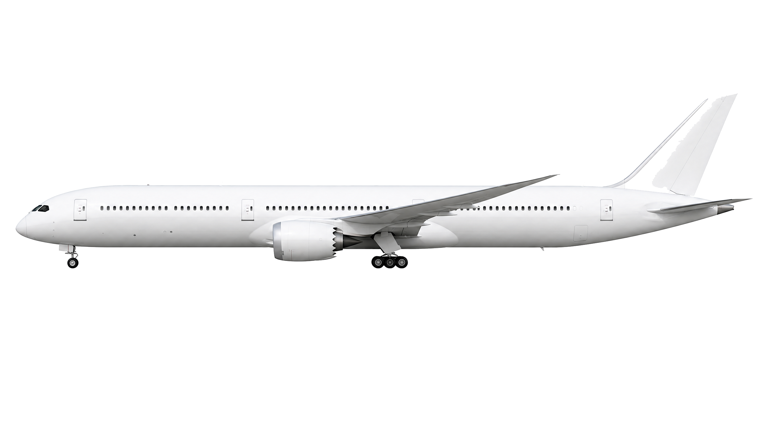 |  |
The full script can be found on my GitHub repository.
Problematic areas for deterministic scripts are the most white-like elements. We can notice halos around edges, faint colored borders where the background was not fully removed. Noise near fine details, like specks or grain around winglets, tail fins, and landing gear. On other aircraft, incomplete removal: parts of the original background still visible near the fuselage or under the wings.
After tweaking the script’s parameters—adjusting the color threshold, increasing edge smoothing, and refining the tolerance for semi-transparent pixels—I reran the background removal. The second pass produced crisp, clean results across all 96 aircraft, like on the corrected examples below:
| ATR 72 | Boeing 787-10 Dreamliner | Boeing 737-800 |
|---|---|---|
 |  |  |
This experience makes a clear point: AI models are not effective at deterministic tasks like background removal. Classic, deterministic programmatic scripts handle this much better. They are always predictable, easier to debug, and significantly cheaper since they use our computing power, instead of calling expensive APIs.
In practice, the right and tested approach is a hybrid pipeline:
- use AI for tasks that benefit from generative capability—creating the aircraft silhouette with consistent style, lighting, and detail,
- use deterministic scripts for tasks that are rule-based and precise—background removal, resizing, format conversion, image compression.
Going further
I spent significantly less time building the proof of concept than I expected, and the results are much better than I initially anticipated. With the AI-generated approach, I was able to validate the entire pipeline: from prompt engineering to batch generation to post-processing—in a matter of minutes, not weeks.
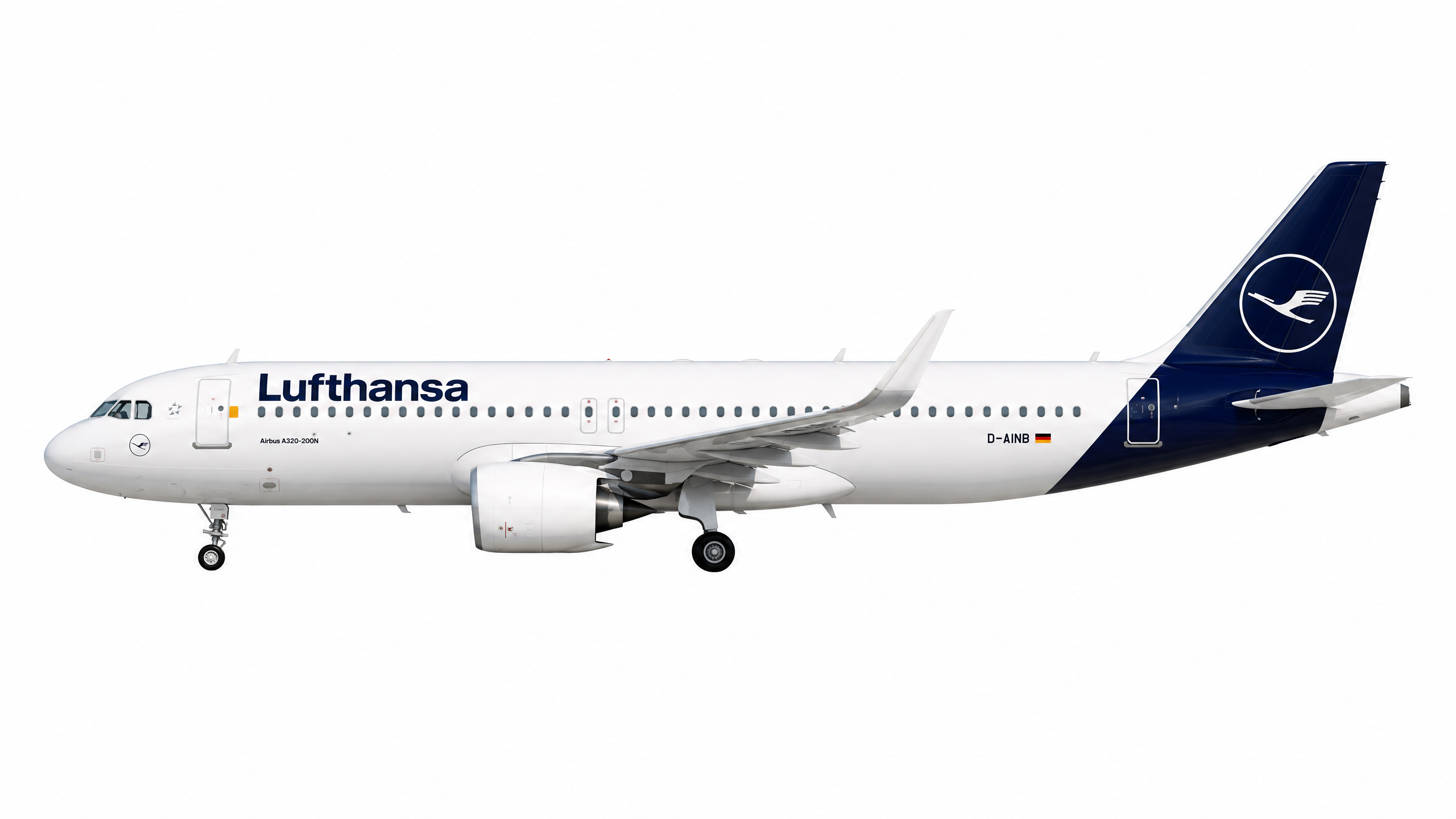
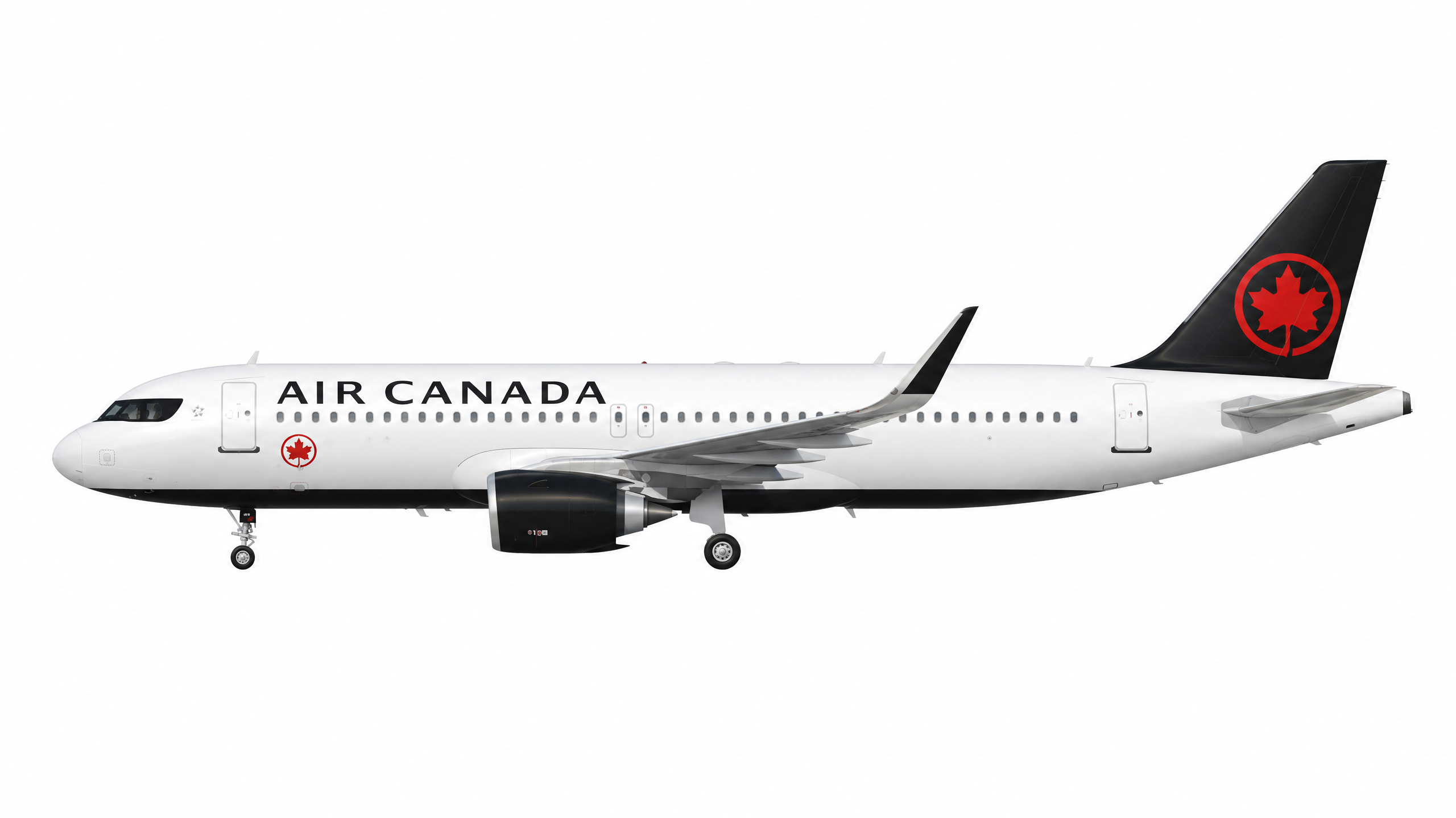
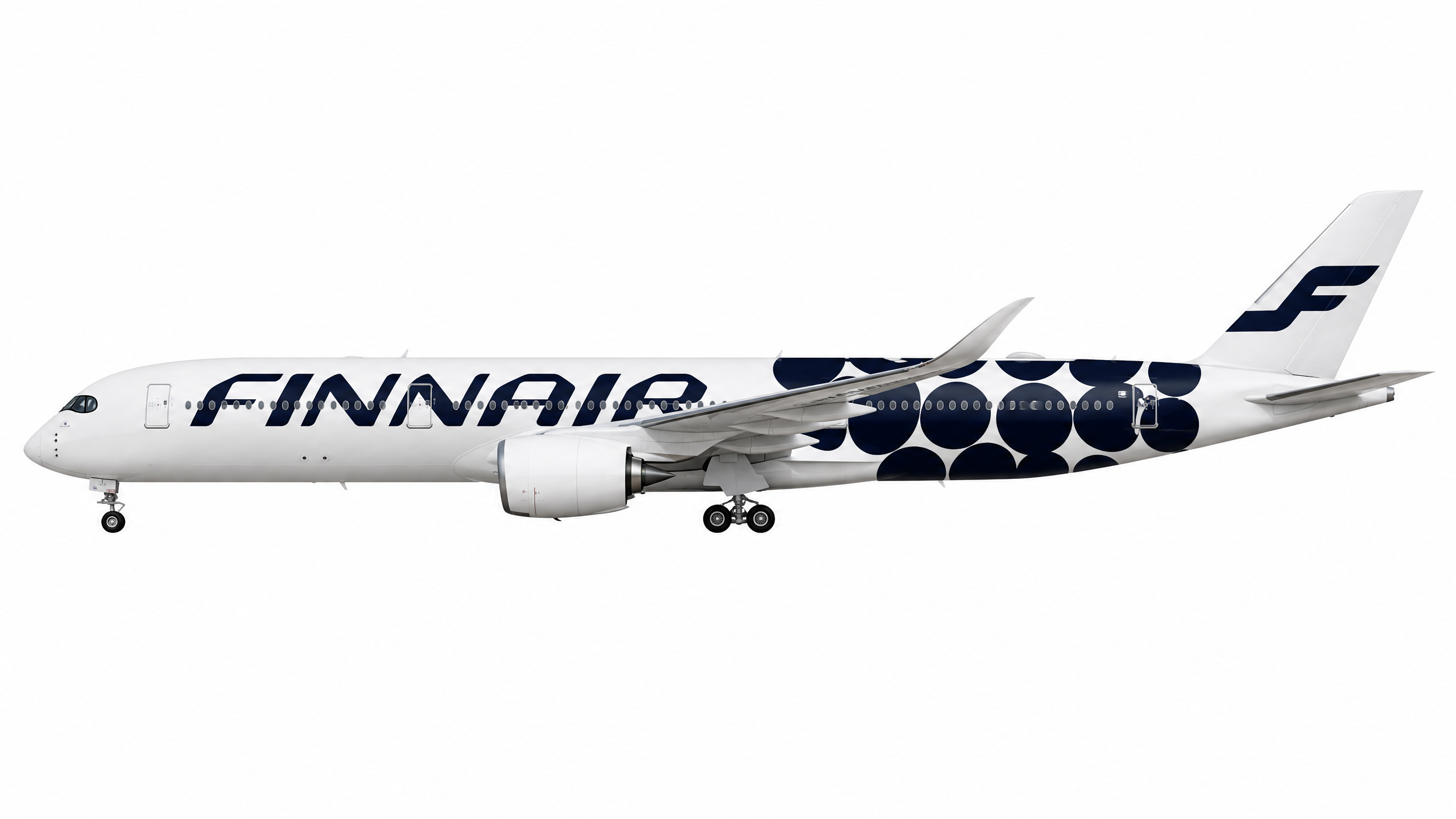
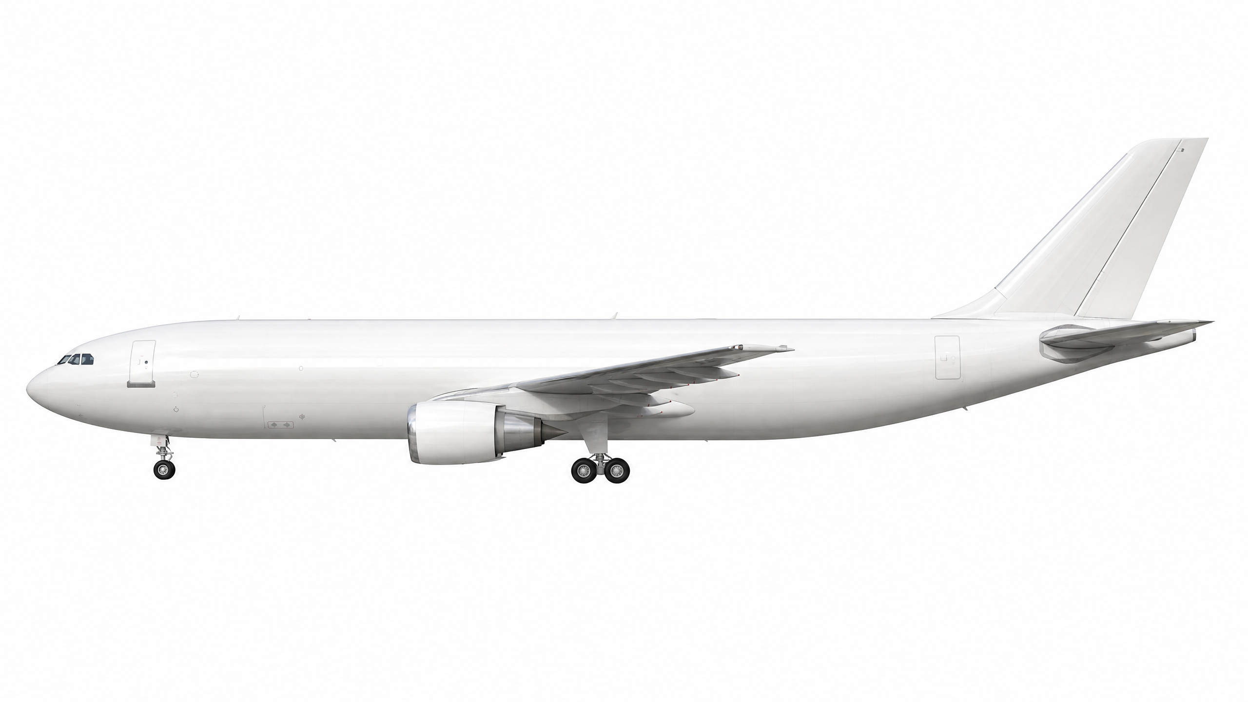
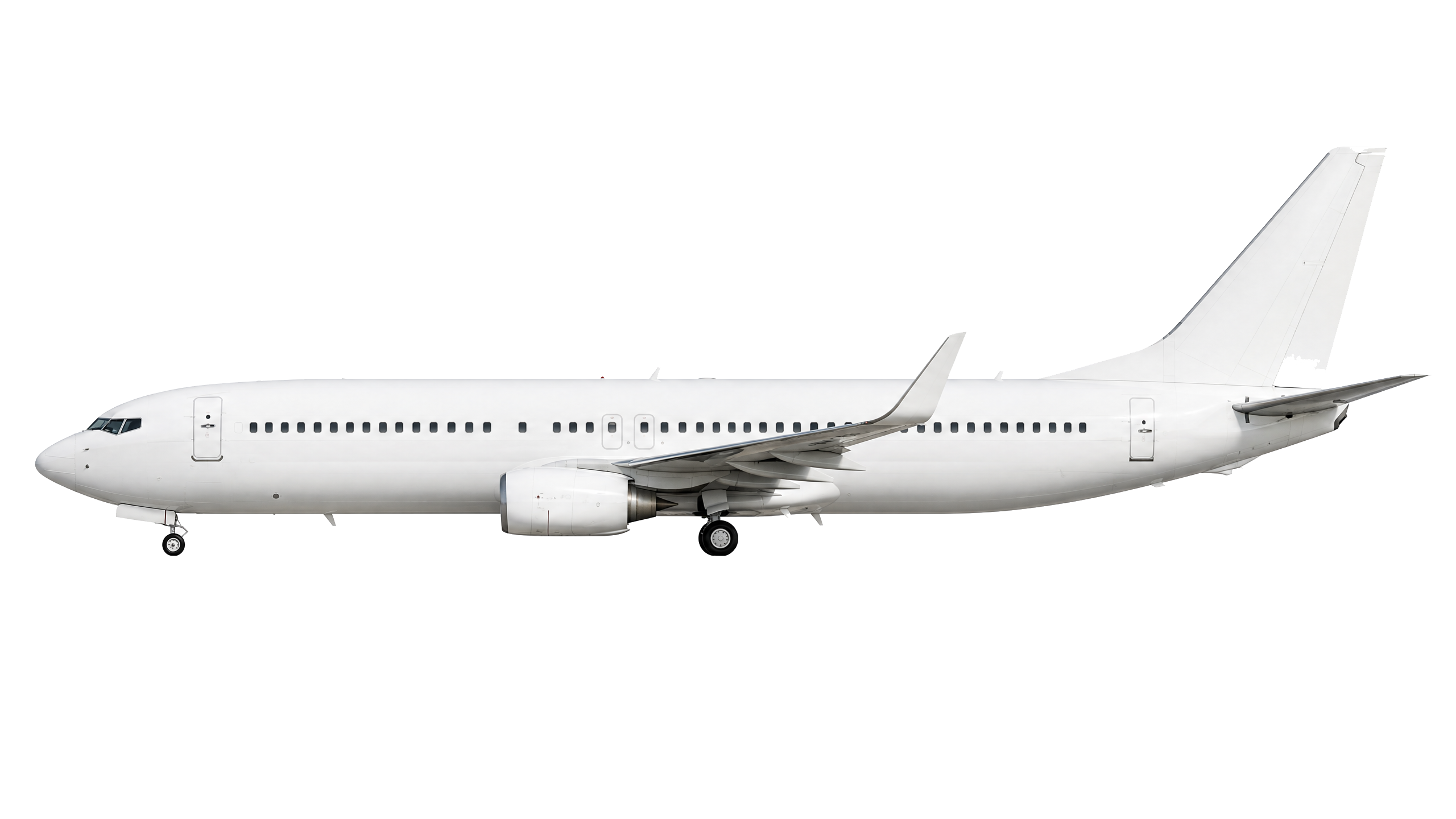
The scalability is a factor, where this becomes truly powerful. I can now generate images not only for each aircraft type, but also for every airline in no time and at extremely low cost. Instead of having one generic Airbus A320 silhouette, I can create variants with different liveries for different airline companies and so on. Each one maintains the same visual style, lighting, and quality, but with the correct airline colors and branding, as seen on the examples below:
| Airbus A320-200 in Lufthansa livery | Airbus A320neo in Air Canada default livery | Airbus A350-900 in Finnair unique Marimekko Kivet livery |
|---|---|---|
| | |
This is a next step in product customization that I did not plan for before. With old-school tools and manual photography, 3D rendering, or Photoshop editing, creating hundreds of airline-specific variants would take ages, or would probably cost me thousands of dollars. FlightRadar app solved it differently, they just signed an agreement with JetPhotos service (and bought it in 2015) they display real aircraft pictures. This would be my way to go, but I have always had this urge to do something differently, sometimes just better.
New approach for product personalization
I can generate thousands of personalized silhouettes on demand, tailored to specific aircraft-airline combinations, without breaking the budget or requiring a team of designers. This opens possibilities for features I had not considered before: personalized flight tracking with airline-specific visuals, dynamic aircraft cards that match the user’s booked flight or even marketing materials that show the exact aircraft and airline combination.
This flexibility also introduces risk. Without proper control over the source materials and output quality, users may end up seeing graphics that contain subtle but noticeable errors. In a consumer-facing application, even small inconsistencies can reduce trust in the visuals and make the feature feel less polished than intended. From a security perspective, attention to detail has become one of the key factors that people use to distinguish legitimate sites from fraudulent ones, because fraudulent pages have traditionally been underpolished and contained typos or low-quality visuals. High-quality, consistent graphics therefore contribute not only to user experience, but also to the perceived authenticity and trustworthiness of the application.
The combination of speed, cost, and general quality makes AI-generated illustration a viable approach for production use, not just experimentation. It transforms what was once a manual, expensive, and slow into something that can be automated, cheap, and instant. However, validation of the output is a key to success.
Validation is also not always straightforward. Catching these kinds of issues often requires domain-specific knowledge because many discrepancies are visible only to people who know what to look for. Aviation specialists, enthusiasts, and technically minded users tend to be especially critical of whether a rendering matches the real aircraft, which raises the bar for accuracy even further. This impacts the possibility of creating such graphics “on the go”, as the validation cannot be automated, we must prepare materials before user requests them.
Nothing will change on the precision-based jobs
My tool, even if it represents close to real-life aviation systems as intended, is just a toy. Even in the fine-graded, monitored, tested, verified examples above, the airframe details are different on each render. For 99% of simple product display cases like here, such visualization will be just okay. But this is unusable for engineering or professional applications.
The inherent nondeterminism of AI image generation means that structural details vary between renders. Landing gear configurations, winglet shapes, engine proportions, and other precise features may change from one generation to the next. Sometimes the differences are subtle; other times there are critical errors: missing parts, incorrect perspectives, or features that do not match the actual aircraft. Regular users will not notice them, but this is simply not acceptable in any of or engineering, certification, regulatory, or professional aviation use.
Aerospace engineers need exact geometric accuracy. Flight simulators used for pilot training require a precise replica of aircraft systems and appearances. Aviation authorities and regulators will never rely on AI-generated imagery for the documentation or compliance purposes. In these contexts, every detail must be verifiable, reproducible, and accurate to the real aircraft, with precision measured in micrometers.
Costs of this case study
I used Perplexity to prompt engineering and script generation. I got a free PRO version license through a deal with PayPal, where all PayPal users could grab it. For OpenAI, I uploaded $15 to the account. I used $4 just to explore, experiment, and generate examples while testing different prompts and settings. I spent another $4.80 for the final production image generation (96 aircraft in total + 6 regenerations).
In comparison to any other tools, subscription services like ChatGPT Pro, Artlist, stock image libraries, or manual design work via web chat interfaces, this is dramatically low. A single professional aircraft illustration from a stock library can cost $10–$50. Hiring a designer to create 96 custom silotypes would cost thousands of dollars. Even subscription-based AI image services typically charge $20–$100 monthly for limited generations, and that would be very time-consuming, inconvenient.
